I have written in the past about the great features YouTube provides to help get your videos to your potential customers, such as annotations and playlists. One feature I haven't spoken about are video cards.
You may have noticed whilst watching a video on YouTube that a little i in a circle appears in the top right corner, usually with some text. These are video cards.
Video cards are a great way to easily link to more of your content, drive viewers to another one of your channels or take viewers straight to a specific page on your website.
Before we get started on the 'how to' section I would just like to note that if you would like to link to your website you need to set up an associated website through YouTube, which can be a little confusing. You can find a walk through on how to do this here.
Now on with the how to.
Step 1: Log in to your account and navigate to the video manager
This step should be familiar to you by now. After you have signed in to your Youtube account, click your user icon in the top right hand corner and select creator studio. From here you need to pick Video Manager from the panel on the left.
Step 2: Select a video and open up the Cards tab
Find the video you would like to add a card to and then click the 'edit' button to the right of the video thumbnail. This will bring up a page your video page where you usually make all of your edits. Simply select the 'Cards' tab from the top bar.
Step 3: Add a card/select card type
Next you will need to click 'Add Card'. This will bring up 3 options for different card types. 'Video or Playlist' allows you to easily link to more of your related videos or even references videos you have mentioned. 'Channel' will send viewers to a different YouTube channel, perfect if you have split branding. Finally, the option we will be using today, 'Link' allows you to add a link to an associated website on your account. Simply click create on the card type you want to use.
Step 4: Create your link
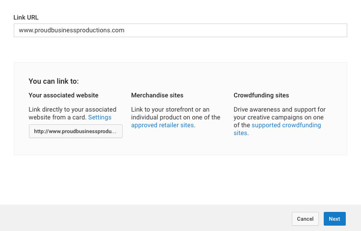
Now it is time to add your link. There are three different options for adding links, the first is from one of your associated websites. The second is from approved retailers, this will allow you to link to your store front or an app store to download your app. You can find a list of approved retailers here. Lastly you can link to a crowd funding page. For this tutorial we are going to use the first option, a link to our associated website.
For the purpose of this tutorial I am going to send viewers to homepage on my website but I could link to any page with the same domain name such as www.proudbusinessproductions.com/blog. I will simply type in www.proudbusinessproductions.com and click next.
Step 5: Design your card
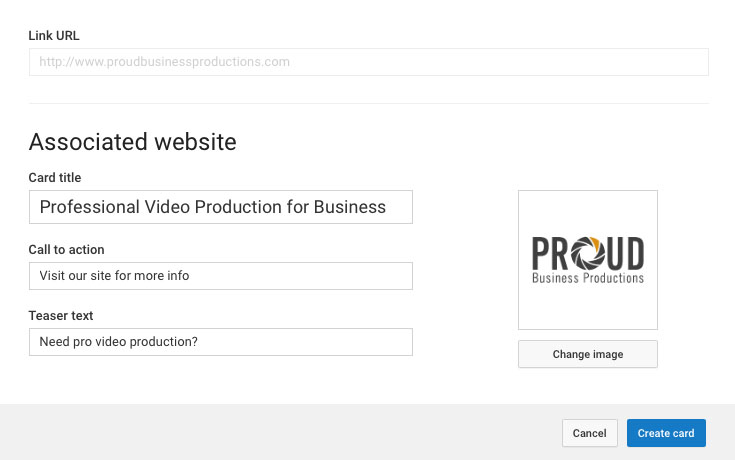
On the next screen you will be presented with options of the details you would like to include in your card, we have three boxes to fill out. The first is the 'Card Title' this will be the heading. Keep it simple, just a few words on where you are sending them.
Next is the 'Call To Action'. This is your selling box, why should the viewer click through to your website? Again keep it simple with just a few words such as 'visit our website to learn more' or 'buy now on the app store'.
Finally we have the 'Teaser Text'. This text will appear next to i symbol before you click on the card for more info. This text only appears for a few seconds so you need to make the most of it. Try to make it a mix of the card title and call to action. For instance if you are demoing a new product and want to take customers to the product page in your store you could write 'Want to learn more?' or 'Click here to purchase'.
By default YouTube will grab the header image from your webpage for your thumbnail but you can also pick a custom thumbnail for your card. Either option is fine but just make sure it is eye catching. Do note that the image has to be in a .png format.
Final Points
After you have clicked save you can now move the placement of the card on the timeline using the bar at the bottom of the screen.
You can also add up to five different cards to each video but I would keep it to around three to stop it feeling like spam. Using multiple cards is great if you are showcasing more than one product, you can easily create one card for each product and send the viewer straight to your store.
I hope you have found this post useful and that you can now see what a powerful tool cards can be if used correctly.
If you would like any help using cards or any other YouTube features please feel free to get in touch.
Thanks.
David Proud
Director
Proud Business Productions


